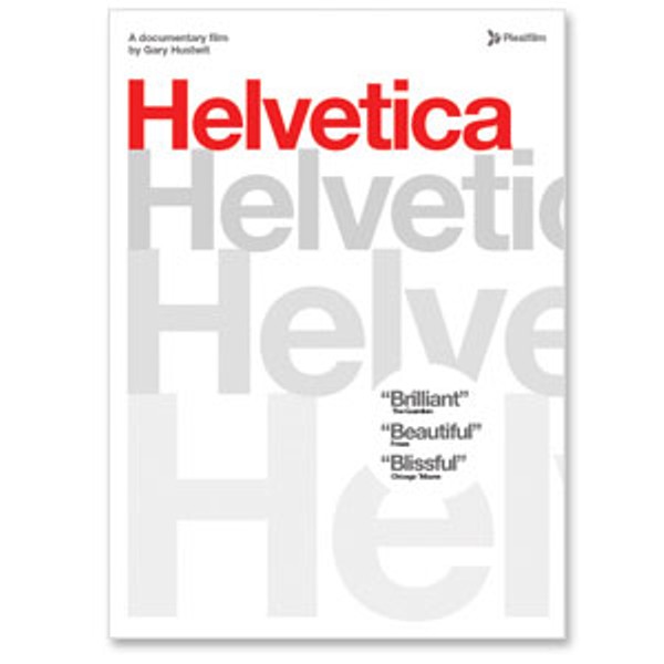
Directed by Gary Hustwit
Plexifilm
A documentary where a bunch of graphic designers sit around giving their thoughts on the merits and deficiencies of a typeface would seem to be a sure recipe for boredom, but Gary Hustwit’s film takes this potentially dry subject and fills it with life and argument. Hustwit, who has a varied background that ranges from working for the indie record label SST in the ‘80s to serving as a vice president for Salon.com, frames the film expertly, making it more about the passions and opinions of a specific subculture than a bloodless history lesson. The discussion of the Helvetica typeface is a point of entry to the world of modern typographers, and they turn out to be a very opinionated, contentious lot.
The film’s artful montages of signs and logos throughout cities like London, Amsterdam, Berlin and New York make the ubiquity of the Helvetica typeface apparent. It’s quite simply become the default delivery system for alphabetic information in the Western urban world of the last 40 years. After a short history of its creation in the ‘50s by Max Miedinger in the Swiss Haas type foundry (Helvetica is the Latin name for Switzerland), the documentary follows its snowballing adoption in the ‘60s, particularly in revamped corporate logos. By the ‘70s it seemed to be everywhere.
The central question of the film is whether Helvetica’s massive popularity is a good thing. Is it merely a clean, classic, readable way of delivering information in many formats, as Massimo Vignelli (who redesigned New York subway signs with the font in the ‘60s) believes? Or is its omnipresence contributing to the establishment of a bland monoculture, a uniform fast food visual aesthetic (as German designer Eric Spiekermann argues in the film). The opinions on the typeface are as varied as the designers, and their conflicting views are the meat of the film.
Paula Scher, the only woman designer interviewed, views Helvetica as the graphic expression of the Military Industrial Complex and a symbol of corporate evil. One need only look at the Exxon Mobil logo to see she has a point.
Coming from another point of view is David Carson, the hotshot experimentalist who set the design world on its head in the ‘90s with the legendarily unreadable Raygun magazine. His evinces a kind of design nihilism, where even the basic function of type, its legibility, is thrown out the window. He views Helvetica not as a threat, but as a stodgy anachronism.
Synthesizing both the classic and the state of the art is the Dutch collective Experimental Jetset, the youngest designers featured. They claim that Helvetica is their design lingua franca, a starting point from which they feel comfortable to experiment.
It’s interesting to note the contrast between the humility of old line designers like Wim Crouwel and Massimo Vignelli and the younger, more attitudinal egoism of the younger designers. It’s the difference between those who see themselves as practicing a craft to solve a problem, and those who have pretensions to being self-expressing artists.
As would be hoped in a documentary devoted to visual culture, the use of high-definition video adds to the cool, sleek presentation of the material. It escapes typical talking-head clichés by intercutting street scenes showing the varied uses of Helvetica in a rhythmic, almost hypnotic way. Whether you end up thinking Helvetica is an aesthetically stifling imposition of order, or just a classic visual form of design, this film will open up your eyes to an aspect of modern visual culture that many take for granted.


Comments